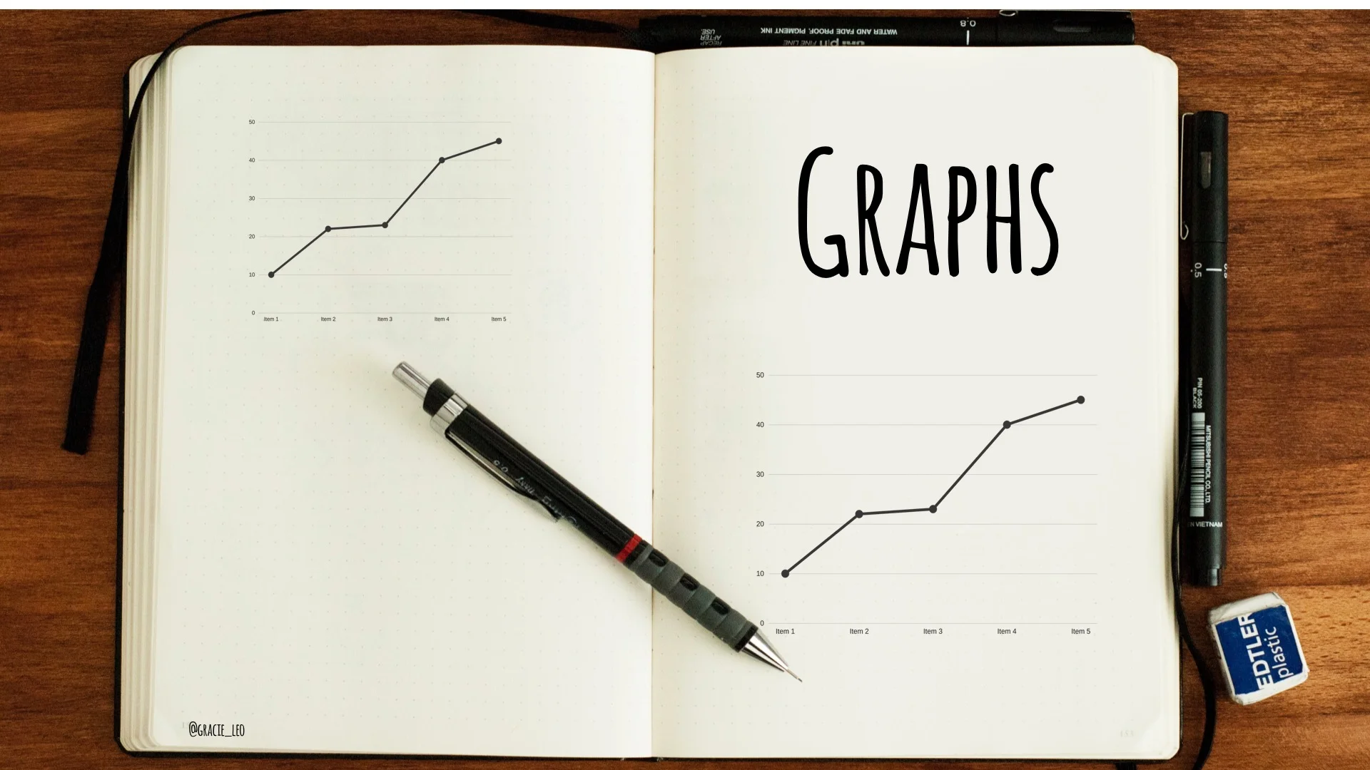
"G" is for Graphs
One of the biggest challenges that healthcare presenters often face is that there is often a large amount of data that they want to convey to the audience. This is particularly true in original research or audit talks in which it is important to clearly explain and demonstrate data.
Graphs are a common tool to represent information and they have great versatility. However they are often more easily understood by their creators than by the audience. It is important to use graphs judiciously and in a way that makes them accessible and intuitive. When used well, they can simplify and illuminate complex concepts.
Turn your "facts" into "figures"
One of my favourite examples of an interactive and engaging use of graphs and data in a presentation is the work of Hans Rolling and his team from Gapminder.org & Vizabi. Check out his fantastic talk (even 11 years on!) at TED on global changes over time in areas including child mortality, income and life expectancy:
There are so many things which make this talk great. One of it's greatest strengths is the transformation of cold, concrete data into living, animate figures which reveal trends and reflects changes over time. Hans passion for world economics is infectious and hopefully this inspires you to understand that even your own seemingly "dry" data set; if viewed with the right eye - has it's own story to tell.
Choosing the right type of graph
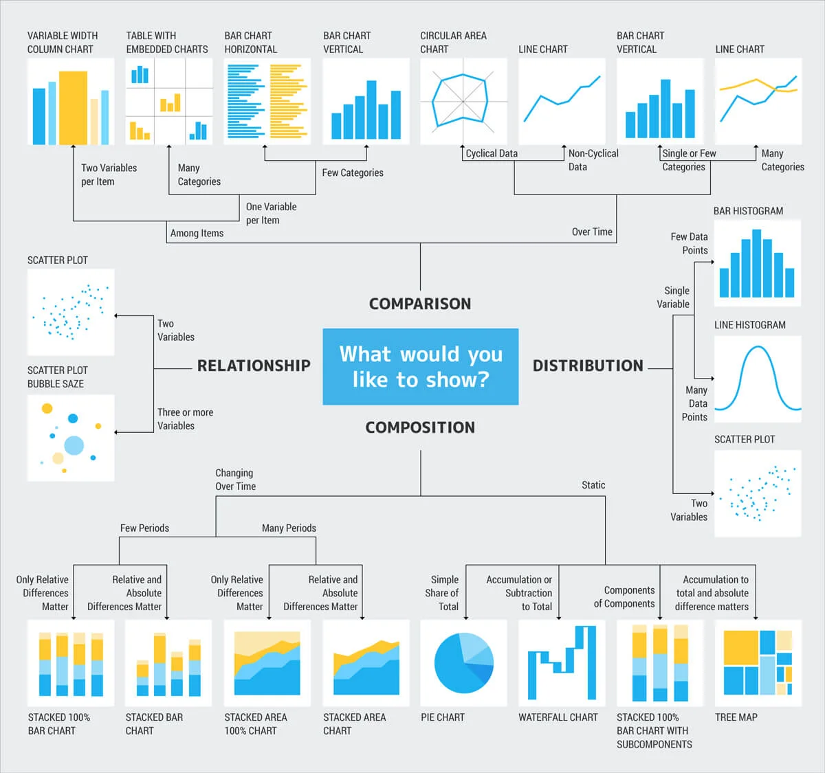
Different graph types have their own unique strengths and weaknesses. For example, column, bar charts and pie charts compare groups, whereas line graphs portray trends. Andrew Abela has created a handy tool which divides chart types by a focus on relationships, comparisons, distribution, or composition. Here is a modified version from the Crazyegg team:
When choosing charts, it is important to keep in mind apt thought from American writer, Gregg Easterbrook, "Torture numbers and they'll confess to anything". This is both a weakness and strength of how we present data - that the act of transforming data points into graphs can on one hand can emphasize key findings, but on the other hand can also manipulate the viewers impression and understanding of proportion and scale. The latter is one of the reasons why I try to avoid excessive use of pie charts or 3D charts which are often difficult to interpret at a glance (Side comment: I found this academic article on scatterplots interesting. It advocates for scatterplots as an alternative to traditional bar and line graphs and also provides free scatterplot templates.)
Maximise the potential of your graphs
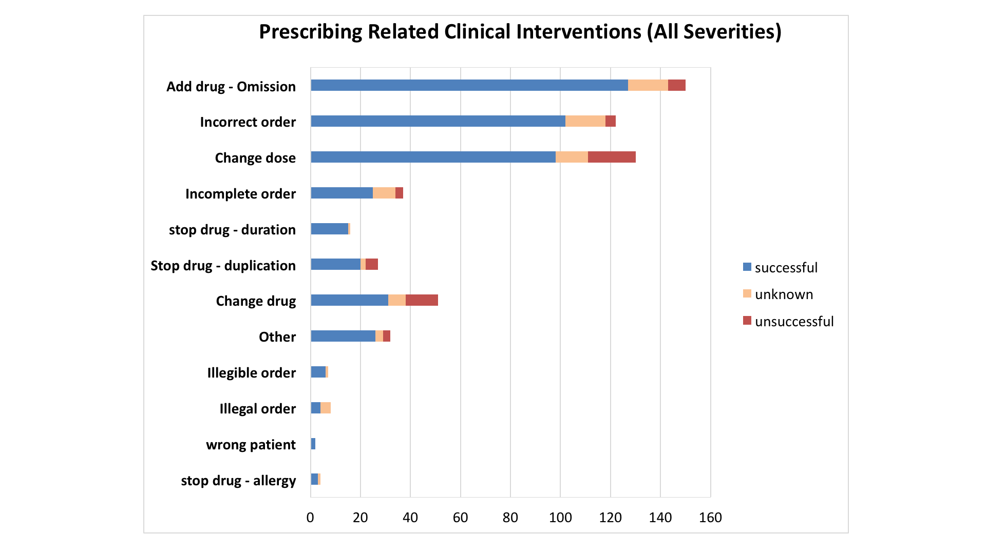
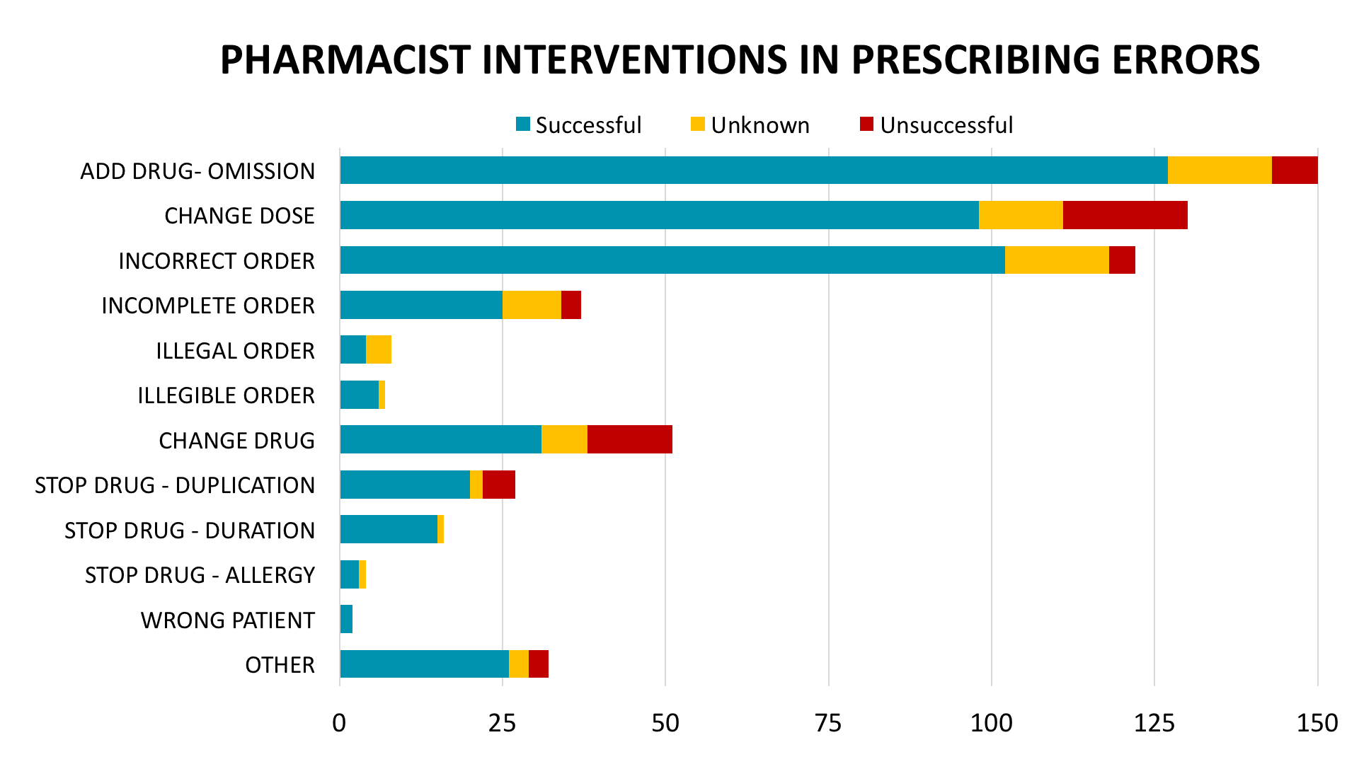
When including graphs in a presentation - it is important that when featured, they 'rule' the slide and don't need to compete with other excess information. You can see in my example below a comparison between an original graph and a modified, maximised graph.
Some of the techniques I have used were:
a) Increasing the size of the graph
- Removing unnecessary border lines
- Keep your graph title to a single line
- Relocating the "key" for your graph to above/below instead of left/right.
b) Choosing an appropriate scale of numbers and measurements
- This enables you to reduce excess space "hanging off" the end of your graph which was seen in the first image.
- Practical scales with easy to calculate increments (eg 20s or 50s as opposed to 30s or 40s) help people to be able to more easily estimate values in their heads.
c) Ordering the data intuitively
- Instead of simply arranging data groups alphabetically, consider arranging by values increasing/decreasing to make it easier to compare trends.
- Another avenue which could be used is to group data points together by using colour or additional shapes such as circles or boxes.
d) Create points of interactivity or engagement
- In the last image of the three you can see that I have "masked" parts of the graph to reduce the cognitive load on the audience but enables me to "reveal" other parts to focus on later in the presentation. (You can "mask" your own graph by placing a white filled rectangle shape over the top of your graph and adjusting the transparency accordingly)
- It is also important when including graphs within the context of a presentation that you carefully think about the conclusions of your graphs and how these might be illustrated by examples or cases. Choose to limit the number of graphs in your talk but focus on them in greater depth and explore their details.
Explore some alternative resources for creating graphs
To be honest, I make almost all of my charts from excel and modify them in excel and powerpoint - I'm familiar with both programs and they are flexible and easy to use. I also have some styles I can recycle and modify from talk to talk. However if I needed to make a presentation with graphs with a strong "wow" factor, I have used or played with these alternative programs and you might like to check out:
Piktochart
Pros: Free, lots of templates available with nice colour palettes and intuitive design
Cons: Paid - however note that the Nonprofit license with full access is only $40 a year.

Amcharts
- Pros: Free use, embeddable in powerpoints and websites, ability to animate/hover over chart for data adds a special air of sophistication to your next talk
- Cons: Moderate learning curve

Vizabi
- Pros: Free use, embeddable, great for public health talks and contains data on regions of the world, poverty and life expectancy.
- Cons: Moderate learning curve, very specific graph types
Got more time?
If you're interested in exploring more about how to use charts as tools to illustrate concepts I've enjoyed watching/reading the following. Please note that they come from a pursuasive/design/marketing perspective rather than a scientific angle:
- Idan Gazit on Data, Design and Meaning (1 hour talk)
- Crazyegg on Data Storytelling (medium length blog post)
- Goodcharts: The HBR Guide to making smarter, more persuasive data visualisations: Excerpt from book http://images.techhive.com/assets/2016/06/10/cw_goodcharts_hbr_book_excerpt_v4.pdf
Phew! So there you have my not-so-brief run down on looking at graphs and how we can use them to transform numbers into characters with a message to share. I hope you enjoyed it and feel empowered to experiment a little the next time you need to give a data-heavy talk!
This post is written as part of the series on Alphabetical Adventures in Slide Design and Presentation! Stay tuned for the next part - "H" is for Hygge.

